
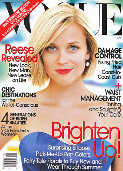
Dear US VOGUE...

.... Would you dare doing it on your cover (Vogue Italia Black issue)? ...

... Or making a one-word one-model cover (Vogue Paris) ?
1. Layout
Compared to Vogue Paris or Vogue italia, both designed by Fabien Baron, the american Vogue lacks a real and concrete visual identity. Vogue Paris is a sheer pleasure from the beginning to the end of the magazine, the typography is carefully studied, the ads are chosen (i.e. we don't find an ad for pills after a dress worth thousands of dollars...). The paper is not as heavy as the European editions.
2. Editorial line
Even though they insist on the fact that they are no Marie-Claire, Vogue US has ambiguous subjects most likely to be found in a Marie-Claire magazine: To my mind, the column "Up front" is good enough for older people, it's so slushy. The "Flash" column wants to appear young and lively, but it really looks like a - chic - "people" column...
And the tone may be a little too friendly sometimes (hey, it's Vogue, I wish they don't say "of, well," or things such as "say,").
Eventually, models are far more representative of fashion than any actress (I would go as far as saying that they give life to the clothes). So, please, models, models, models on the cover.
I mean, it's no surprise that even ELLE will have more ad pages in September than Vogue: ELLE's layout is much younger.
Two words to improve Vogue US: Audacity and elitism.

No comments:
Post a Comment
Note: Only a member of this blog may post a comment.